

UI/UX Designer
4 Weeks
Fintech AI
Mobile App
Most people do not avoid financial apps because they dislike managing money. They avoid them because the experience often makes them feel overwhelmed, anxious, or judged.
Existing solutions typically fall into one of two categories. They are either so simplified that they provide little practical value, or so data-heavy that users abandon them within days. Neither approach encourages long-term engagement.
LAXMII was designed to sit between those extremes.
The challenge was to create a mobile experience capable of presenting complex financial information, including spending patterns, savings goals, net worth tracking, and AI-generated recommendations, without overwhelming the user or creating negative emotional responses.
The goal was not simply to make financial data visible. The goal was to make financial decisions feel approachable.
I started by mapping the emotional experience of looking at personal financial data, not just the functional gaps in existing apps. The research question was not “what features are missing” but “why do people avoid opening their finance app in the first place.” The answer was consistent: apps made users feel judged rather than helped.
That finding became the foundation for every design decision that followed. I defined three core user types: the overwhelmed spender who knows they overspend but cannot locate where, the anxious saver who contributes inconsistently out of stress rather than strategy, and the net worth builder who wants a complete financial picture but has never had all their data in one readable place.
Every feature was designed with at least one of these personas as the primary user, not all three simultaneously.
With the personas and emotional insight in place, I explored how each core feature could be reframed. The recurring design challenge was the same across all five features: how do you present financial data in a way that prompts action rather than avoidance? I mapped competing content approaches for the AI insights panel, the savings goal interface, and the dashboard before committing to a direction.
The principle that emerged from this stage and held across every subsequent decision was: design around emotion first, data second.
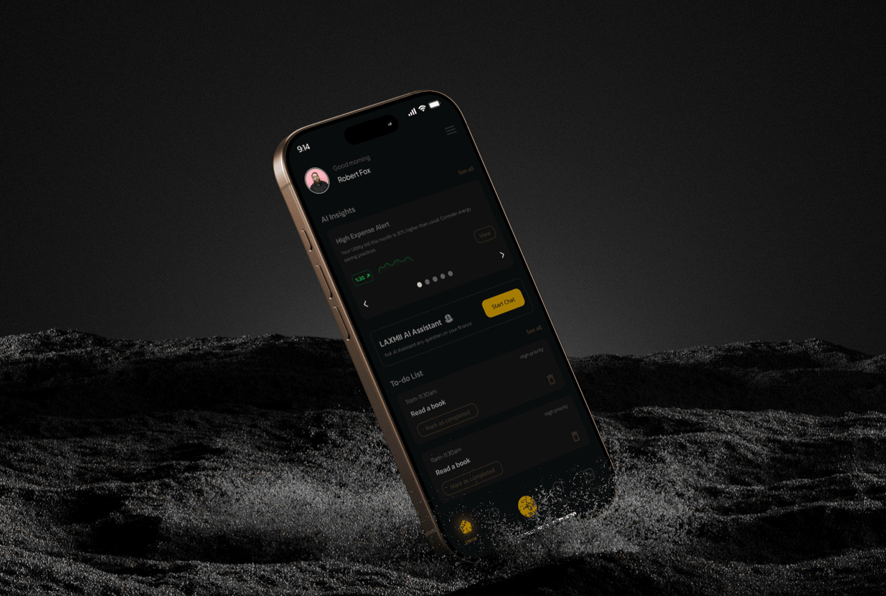
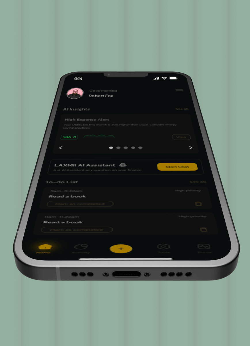
I built low-fidelity wireframes for all core screens: the dashboard, expense tracker, savings goals, AI insights panel, and net worth calculator. The dashboard layout was the hardest problem. My first three wireframe versions failed the same way: everything felt equally important, so nothing did.
The breakthrough was imposing a strict information hierarchy with net cash flow at the top as the single most critical number, followed by savings progress, spending breakdown, and the AI insight of the day. That structure gave the screen a reading direction and stopped it feeling like a report.
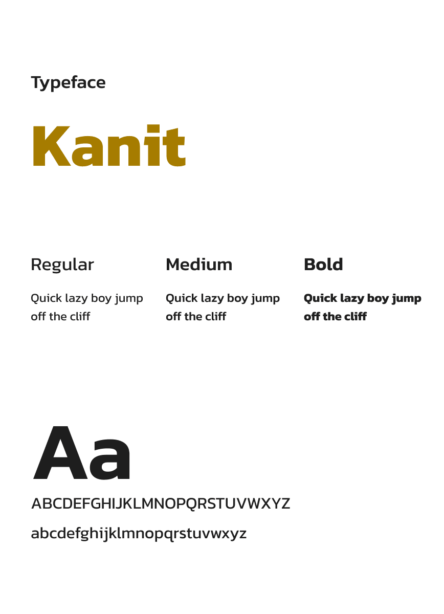
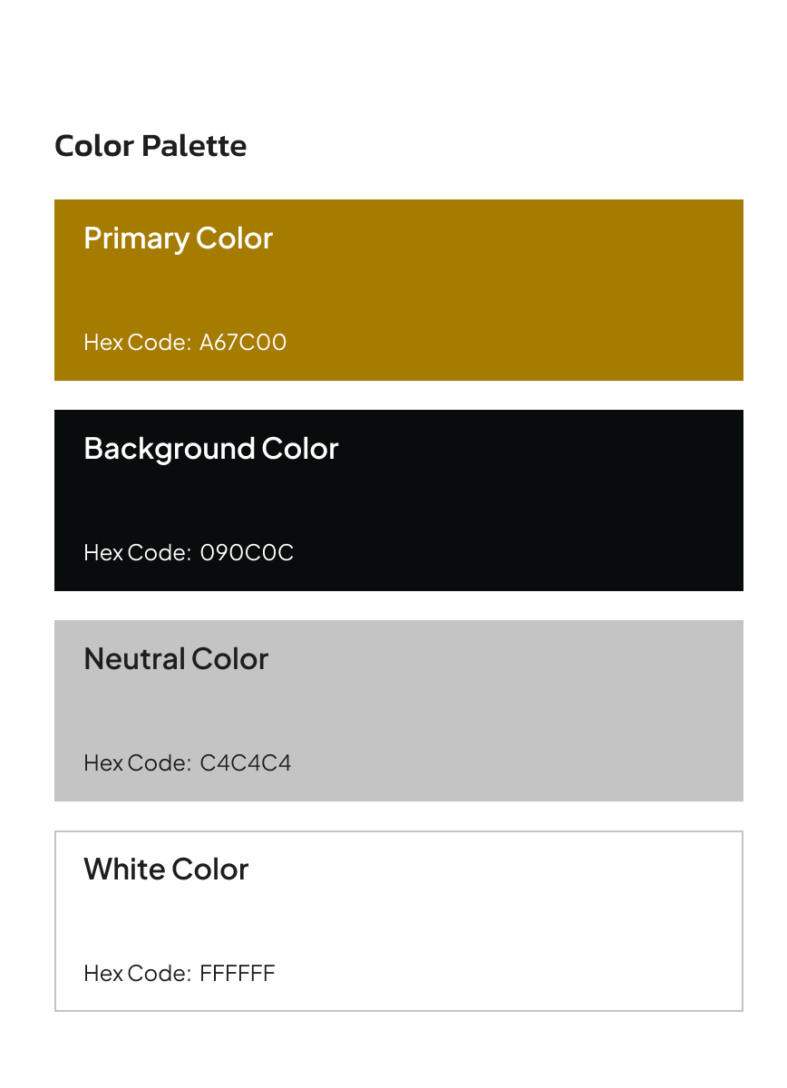
Before building any high-fidelity screens, I established the visual language: typography scale, color palette, component library, and spacing system.
High-fidelity design was built across all screens to the same system established in the style guide stage. Every screen had to pass the same test before it was finalised: would this make someone feel more capable of managing their money, or less? Not impressed by the design. More capable. That distinction guided every visual hierarchy choice, every color decision, and every moment where I chose to show less information rather than more.
My first instinct was to design the AI insights panel as a notification system, a card that flagged anomalies and fired when thresholds were crossed. It was the obvious pattern. The problem was that it replicated exactly what users already found anxiety-inducing: being told something was wrong. A red card saying “overspending in food delivery” is functionally identical to the judgmental data experience I was trying to replace.
Instead, I designed the AI insights panel as a personalised daily check-in. One or two observations surfaced each day, framed as curious observations rather than warnings. Not “you overspent on food delivery.” Instead: “You spent 40% more on food delivery this week than last week — want to set a weekly limit?” The tone is warm and specific. The framing is forward-looking. The design principle that made this non-negotiable: if a user feels criticised by a notification, they will turn it off. If they feel helped by it, they will act on it.
The standard savings goal interface is a progress bar with a percentage. I built it that way in my first wireframe because it was the obvious, clean solution. Then I looked at it against the anxious saver persona and realised the problem immediately — a percentage bar at 23% looks like failure, not progress. The metric is the wrong unit of motivation.
I redesigned savings goals to frame progress as a journey toward something named and visible: a holiday, an emergency fund, a target the user had chosen. The visual language moved from “how much of the task is done” to “how close are you to the thing you want.” Goal-framing increases motivation more reliably than metric-framing — the behavioural research is clear on this. The design had to reflect that psychology, not contradict it. The constraint that made this non-negotiable: an app that makes saving feel like deprivation will be deleted. An app that makes saving feel like momentum will be opened daily.
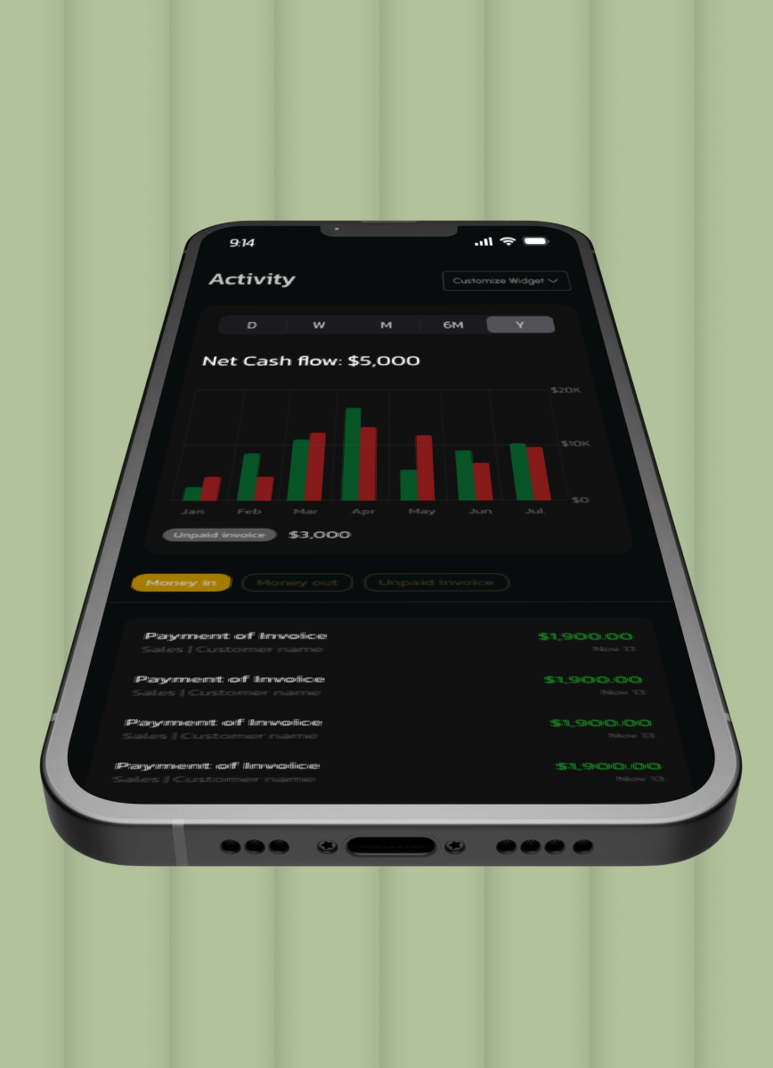
My initial design for the net worth calculator showed a single number — assets minus liabilities, updated in real time. It was accurate. It was also nearly meaningless in isolation. The question users actually care about is not “what is my net worth today” — it is “am I moving in the right direction.” A single number without temporal context cannot answer that.
I added a trend line showing net worth over time, plotted against the user’s own historical data. The line is the insight. A number going up by £200 feels different when you can see it is up £200 for the fourth consecutive month. The static view answered the wrong question. The trend view answered the one that actually drives behaviour.
I delivered a complete high-fidelity mobile UI across all five core features: the financial dashboard, AI insights panel, automated savings goals, expense tracking feed, and net worth calculator. Every screen was built to the same design system, typography scale, colour palette, component library, and spacing rules established before a single high-fidelity screen was drawn. The dark background with gold accent on primary metrics was a deliberate hierarchy decision, not an aesthetic one: it made the most important numbers visually dominant without requiring larger type sizes. The result was a screen that communicated financial status instantly, without demanding effort from the person reading it.
Every screen had to pass the same test before it was finalised: would this make someone feel more capable of managing their money, or less? Not impressed by the design. More capable. That distinction guided every visual hierarchy choice, every colour decision, and every moment where I chose to show less information rather than more.

If I returned to this project, I would run usability tests on the dashboard hierarchy before committing to it. I made the information priority call based on the personas and research insights, and I believe it was the right call. But I made it without direct user validation of that specific structure. Testing three hierarchy variations with real users would have either confirmed the decision with evidence or surfaced a genuinely better sequence I hadn’t considered. What the project gave me was a sharper framework for designing emotionally intelligent data interfaces, the principle that how data is framed matters as much as the data itself is now the first lens I apply on any information-heavy design brief.
It does not need to be fully scoped. Tell me what you are working on and what you are trying to achieve, I will come back with an honest view of what is possible and how I would approach it.