

WordPress Developer / UI/UX Designer
1 Week
Agrifood / E-Commerce
Figma, WordPress, Elementor, Cloudflare, OCI
Protein Basket needed more than a website. It needed a way to establish trust before a visitor had ever purchased a product.
The challenge was specific to the local market. Buyers sourcing food products through traditional channels are accustomed to inconsistent quality, uncertain product origin, and little accountability after purchase. A generic food business website would not solve those concerns because the hesitation was not informational. It was emotional.
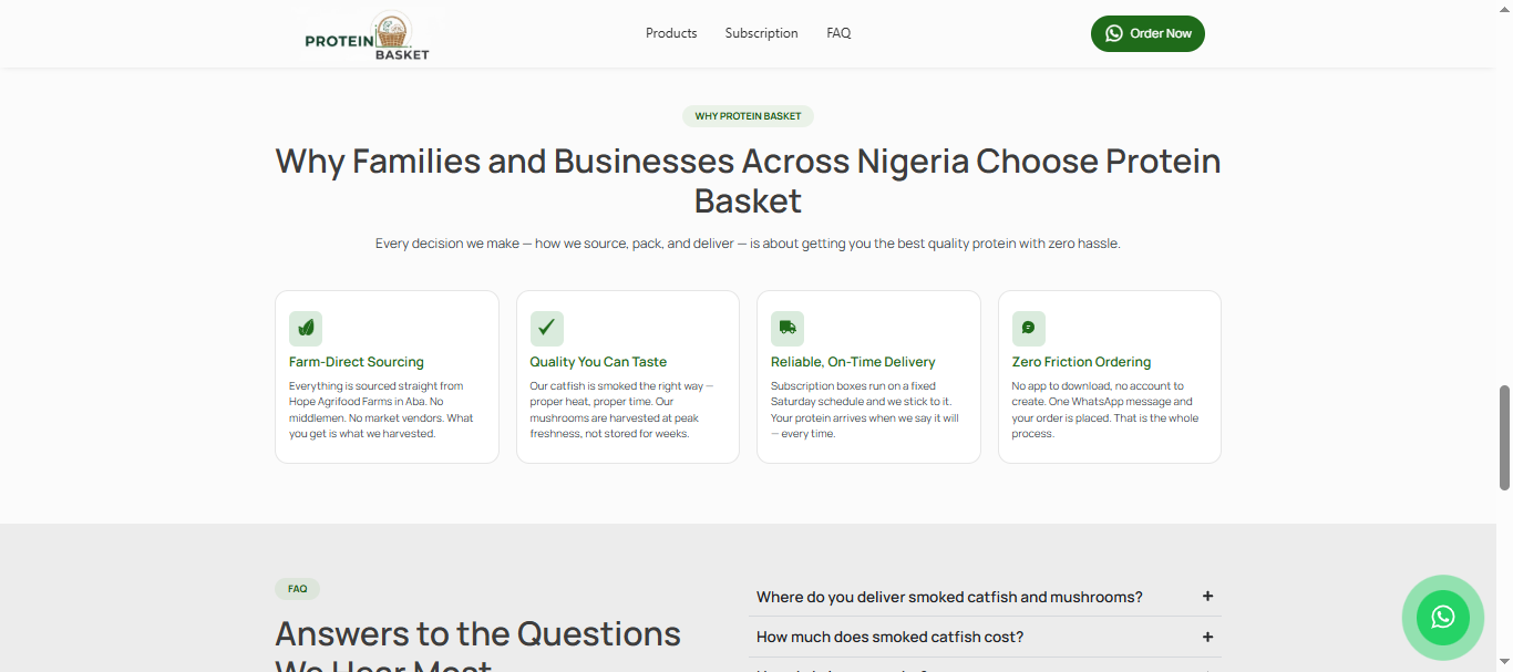
The objective was to design a landing page that could establish credibility, communicate farm traceability, and reduce purchase anxiety within the first few seconds of a visitor arriving on the site.
Every design decision was guided by a simple question:
How do we make a first-time visitor trust the product before they have ever tasted it?
Before designing any screen, I mapped the questions a first-time visitor would naturally ask:
The landing page was designed to answer those questions in sequence. Every section exists to remove a specific objection before introducing the next decision.
The result was less of a traditional marketing page and more of a trust-building journey that moved visitors from discovery to purchase.
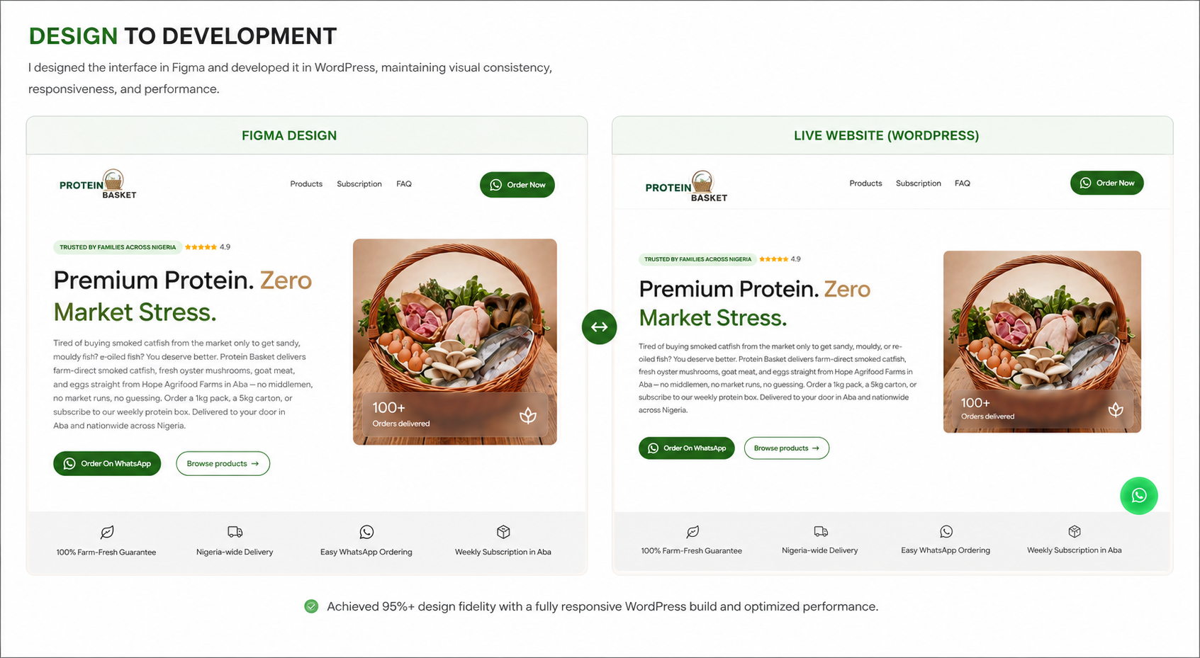
I designed the complete experience in Figma before building anything in WordPress.
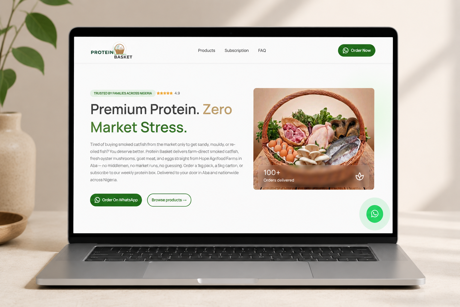
The visual direction focused on earthy greens and warm neutral colours that reflected freshness, farm origin, and natural quality. The imagery strategy prioritised authenticity over polish. Instead of relying on generic stock photography, the design highlighted the actual source of the products to strengthen trust and reinforce transparency.
Every visual element was selected to reduce the distance between the farm and the buyer’s screen.
The site was intentionally designed as a single scrolling experience.
The hero section established the core brand promise, Farm to Pot. Nothing in Between, supported by product imagery and a direct WhatsApp call to action.
The following sections introduced the farm story, product categories, subscription options, and ordering process in a logical sequence. Each section had a single responsibility and prepared the visitor for the next decision.
This approach reduced cognitive load and ensured visitors could understand the business without navigating across multiple pages.
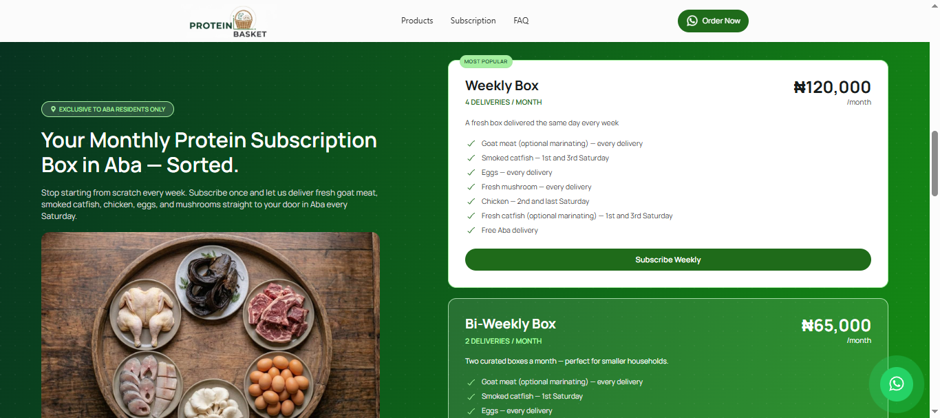
The subscription offering required careful presentation.
Two subscription plans needed to be compared quickly without forcing visitors to read large blocks of text. I used a card-based structure that highlighted pricing, delivery frequency, and included products in a format that could be understood at a glance.
The objective was to make comparison effortless and remove friction from the decision-making process.
One of the most important design decisions was treating the trial box as its own product rather than a promotional offer.
Many visitors would be interested in the products but hesitant to commit to an ongoing subscription. The trial box was designed specifically for this audience.
Instead of presenting it as a discount banner or temporary offer, I gave it a dedicated section with its own messaging and call to action. This positioned the trial box as a low-risk entry point that allowed visitors to experience the product before making a larger commitment.
Every call to action directed visitors to WhatsApp rather than a traditional contact form or checkout flow.
Each product category included a pre-filled WhatsApp message, allowing visitors to start a conversation with the relevant product already referenced.
This reduced the distance between purchase intent and order placement to a single tap.
The final site was deployed on Oracle Cloud Infrastructure with Cloudflare handling DNS and SSL configuration.
A multi-page site would have allowed more content depth per section. I built a single scrolling page instead because the buyer journey for a first-time Protein Basket visitor was linear: understand the brand, see the products, understand the subscription options, place an order. A single page kept that journey uninterrupted. Navigating between pages introduces drop-off at every click. A single scroll does not.
A contact form or cart checkout was available as an option. I chose WhatsApp ordering as the primary path because it matched how the target buyer already communicated and removed the trust barrier that entering payment details on an unfamiliar site would have created. A pre-filled message opening a real conversation with a real person was the right first ordering experience for a brand the buyer had never transacted with before.
A trial box positioned as a promotional banner feels temporary.
I wanted visitors to see it as a genuine purchasing option designed specifically for cautious buyers.
Giving the trial box its own dedicated section reinforced its importance and made it easier for hesitant visitors to move forward with confidence.
Food brands often focus entirely on the finished product.
I deliberately highlighted the source of the products alongside the products themselves.
Showing the farm environment and production origins helped reinforce transparency, traceability, and quality. For this audience, understanding where the food came from was just as important as seeing the final product.
The final site transformed Protein Basket from a product supplier into a credible digital brand.
Visitors arriving from Instagram, WhatsApp referrals, or search results could immediately understand what the business offered, where the products came from, and how to place an order.
The single-page structure reduced navigation friction, while the subscription comparison cards simplified decision-making for recurring buyers.
The trial box provided a low-risk entry point for hesitant visitors, and WhatsApp ordering reduced the distance between interest and purchase to a single tap.
Most importantly, the site established trust before asking for a sale. Every section was designed to remove uncertainty, reinforce credibility, and guide visitors toward a confident purchasing decision.
The result was a landing page that functioned as both a sales tool and a trust-building system for a growing food brand.
It does not need to be fully scoped. Tell me what you are working on and what you are trying to achieve, I will come back with an honest view of what is possible and how I would approach it.